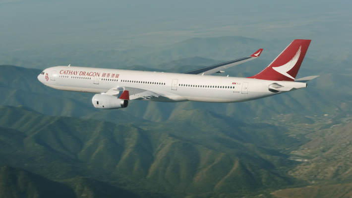
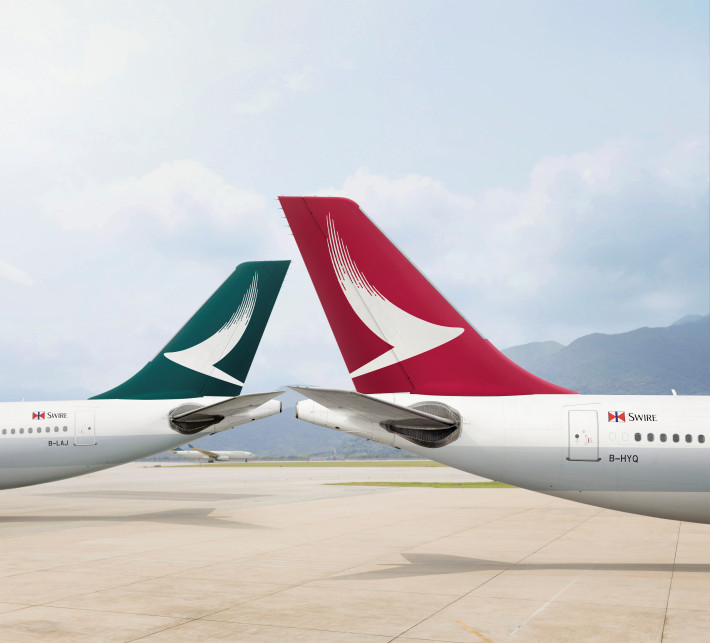
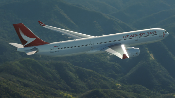

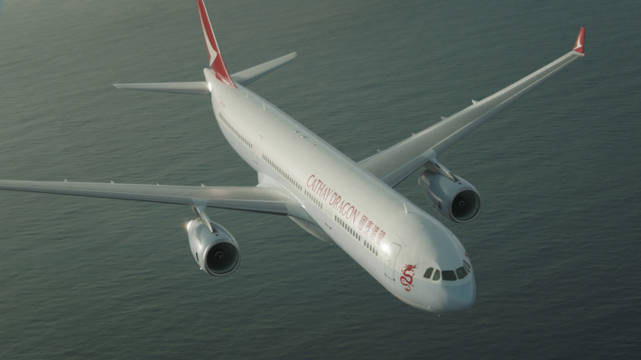
THE NEWLY RENAMED Cathay Dragon has just started its life as an airline brand. Originally named ‘Dragonair’, the Cathay sibling has very clearly positioned itself alongside the internationally recognised Cathay Pacific.
On first glance, the rebrand may just look like a red Cathay Pacific brushwing tailfin and a new name, but the brand has undergone a sensitive and extensive repositioning that will make for one of the strongest Asian (perhaps even global) airline brands by the end of the year.
Through a multi-part series of stories, we talk exclusively with Cathay over the next few months to look at the rebrand in detail, as the new Cathay Dragon touch points and products are rolled out across the network.
Why The Change?
Cathay Pacific and Dragonair used to have a very unique airline alignment. Both airlines were part of the same group, yet had different visual identities. Cathay Pacific was well known globally, but the brand was less well recognised in China. Dragonair however, was well known in China and less well known globally. In a bold step, both carriers decided on aligning their brands to create a connected brand architecture that strengthened both brands in their counterpart’s market.
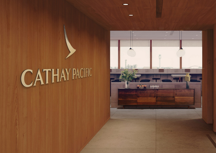
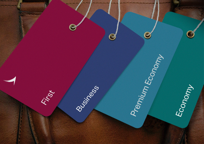
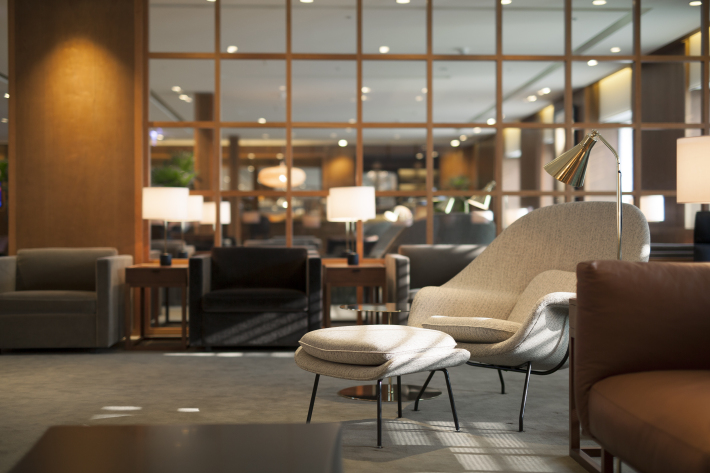
The two airlines now offer a seamless travel experience. Both airlines maintain a distinct brand language for hard products such as seats, inflight entertainment, and loyalty programme; while allowing for unique differences in service and soft product (such as uniforms, food and beverage options, soft furnishings and inflight magazines). A lot of these elements already exist – for example, passengers on Dragonair flights use Cathay Pacific lounges in Hong Kong. However, passengers who didn’t realise the relationship between the two carriers, would feel they were in a third party lounge. The new rebrand addressed the need for the relationship to be more intuitively understood.
Similar But Not The Same
The newly launched Cathay Dragon, which was brought to life in a collaboration with Eight Partnership, Cathay’s current brand agency, shares much of the same ethos with the newly revised Cathay Pacific brand, and there are good reasons. Ruaraidh Smeaton, Manager Brand, explains: “We want people to start thinking about these two brands together – the relationship to one another and the resultant seamless travel experience – rather than two completely separate brands.”
Jonathan Magee from Eight explains why. “This was part of the process from the outset. We knew that there would be the need to align the two brands when we were working on the Cathay Pacific brand refresh. We worked closely with the Cathay Pacific and Dragonair teams to think about the customer experience for travellers flying either one or both of the airlines.”
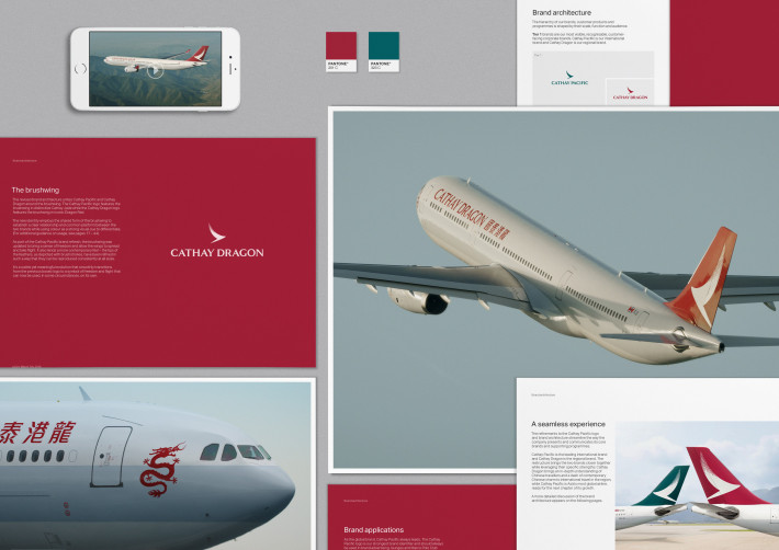
They both have brand pillars based on ‘Heartfelt warmth’, ‘Considered Simplicity’ and ‘Joy of Discovery’. In fact, the only difference is based on the fourth pillar: ‘Contemporary Chinese’ for Cathay Dragon and ‘Contemporary Asian’ for Cathay Pacific, reflecting the brand spirit are the heart of the two airlines.
In fact, Cathay Pacific’s “Asian” influence naturally fosters Cathay Dragon’s “Chinese” and means the two brands are appropriately linked in their design language.
“Whether you are a lounge architect, digital designer or product designer, you should be thinking about both brands at the same time – where they should align, and where they should be subtly different,” Smeaton continues.
Cathay Dragon came about through a process of speaking to many voices within Cathay Pacific and Dragonair, the airlines’ Marco Polo Club members and customers from lower-awareness countries. It was important to understand the challenges associated with the existing brand positioning and how customers perceived the relationship between the two airlines – all whilst valuing the unique aspects of the Dragonair brand which resonated with customers.
“We knew where we wanted to position the brand, but through the process didn’t want to alienate those who were familiar and already loved the brand.” It’s a sensitive environment bringing in two very similar airline brands, who’ve been linked for many years, yet have two separate communities of cabin crew, pilots and ground staff,” says Smeaton.
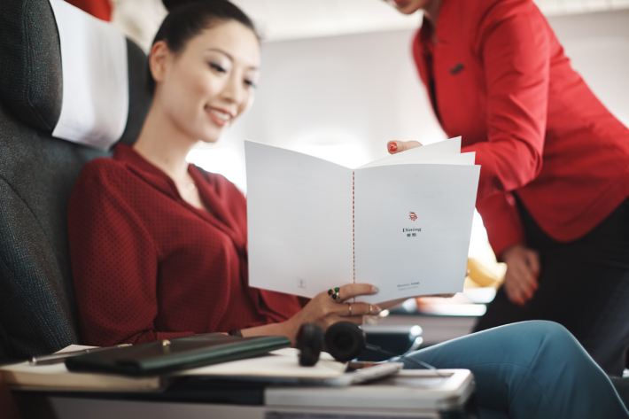
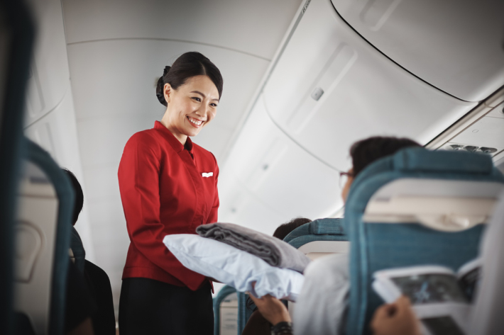
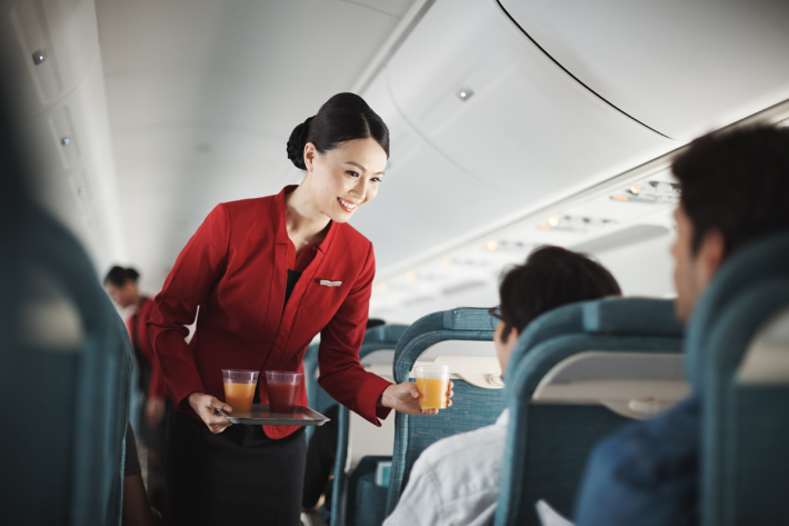
It’s true to say that there are operational efficiencies by aligning hard product and lounges, but the two airlines had one element that research dictated had to stay nuanced, and that was the subtleties in the inflight experience. Cathay Pacific maintains a warm and professional international service offering, shaped over 70 years. Whilst delivering an equally professional experience, Dragon’s younger, regional footprint gives it a subtle distinction.
It was important that the carrier struck a balance though. It wasn’t just about turning Cathay Dragon into an airline brand which is distinct and differentiated in the growing mainland Chinese airline market.
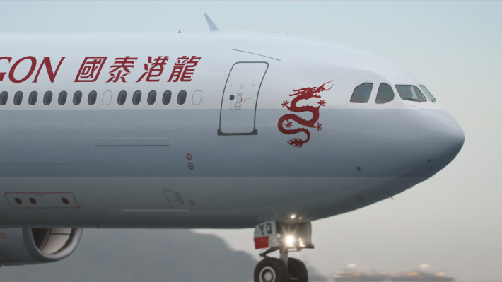
“The term ‘Contemporary Chinese’ is very much based on culture, such as Chinese artists and designers. We saw an opportunity here for Cathay Dragon to have a different feel from Cathay Pacific. Where we may look at a blanket design for Cathay Pacific and take influence from Southeast Asia perhaps, for Cathay Dragon we would look to Chinese communities for inspiration,” said Ruaraidh Smeaton.
The points of differentiation need to be carefully crafted for these two carriers, however. On the ground, especially in Hong Kong, passengers on Cathay Dragon flights will experience Cathay Pacific lounges, so the areas where this new sister brand really get to come to life are mainly on the aircraft. “It’s about creating one unified, seamless travel experience, whether you are travelling to China from New York, or across to Southeast Asia from Beijing,” states Smeaton.
But will there be enough elements to differentiate the onboard experience between the two airlines? After all, the seating products are the same between the two carriers.
Cathay Dragon has a fine line to walk. It’s clear to see the airline has a contradiction on its hands: on one hand it has to sit as a unique airline that has its own service and signature brand trademarks; and on the other, it has to be similar enough so as not to feel different from Cathay Pacific.
This is the first time two major mainline carriers have aligned themselves. Mergers and alliances happen all the time, but these make for one brand (such as LAN and TAM) or two completely separate brands (British Airways and Iberia) but this is the first time two carriers have aligned themselves from a brand ethos whilst maintaining distinct brand names.
The rebranding and new Cathay Dragon name is very much about brand awareness. When looking at the rebrand, it is less about the nuances found in each carrier (which still very much exist) and more about connecting the dots between these two brands. Cathay Dragon now firmly aligns itself with its bigger sibling, and there is great strength to be found in this. The perception will be of a larger carrier, with a stronger network, making passengers look favourably on the airline group.
When looking at fleet size or passenger numbers, it is clear to see that Cathay Pacific is the bigger brand, but China is one of the world’s fastest growing regions for airlines and it would be foolhardy to ignore that. It’s pretty clear to see that renaming Dragonair to Cathay Dragon introduces the more dominant brand into the Chinese market, without alienating the original passenger base. It’s a smart move, and perhaps within a matter of years, the two brands will once again go through a similar evaluation and we could see the Dragon element disappear completely, although its still far too early to say – and Cathay Pacific remain tight lipped on this, only expressing their excitement for the new Cathay Dragon brand.
Stay tuned next month for part two of our exclusive series that will delve deep into the rebranding process for Cathay Dragon, looking at the areas of rebranding the identity and inflight experience.
Article property of TheDesignAir