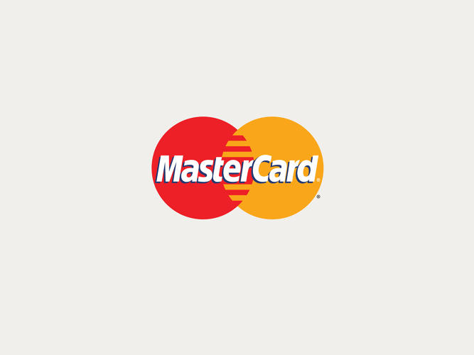
MASTERCARD REVEALED A REDESIGN of its consumer-facing logo, the first in 20 years. The way we buy and pay for things has changed dramatically in the past two decades ago—think about the proliferation of payment platforms like PayPal, Venmo, and Apple Pay. While MasterCard has evolved with the times by introducing digital products and creating new technology for credit card payment systems, its logo—two intersecting circles with a wordmark superimposed—was stuck in the 1990s. To create an identity system that could simplify and clarify the brand to the millions of people around the world who use its services, MasterCard brought on the esteemed design firm Pentagram.
“Everything has changed in the past 20 years,” Michael Bierut, the Pentagram partner who oversaw the project, says. “There was a lot of screw tightening and design tinkering happening [with the logo] in the first 30 years of the company. Then they almost got frozen in 1996. If you have a MasterCard in your wallet, that’s the logo you see. . . . The trick then is, how do we leverage 50 years of equity with enough TLC to provide a new system?”
“Everything has changed in the past 20 years,” Michael Bierut, the Pentagram partner who oversaw the project, says. “There was a lot of screw tightening and design tinkering happening [with the logo] in the first 30 years of the company. Then they almost got frozen in 1996. If you have a MasterCard in your wallet, that’s the logo you see. . . . The trick then is, how do we leverage 50 years of equity with enough TLC to provide a new system?”
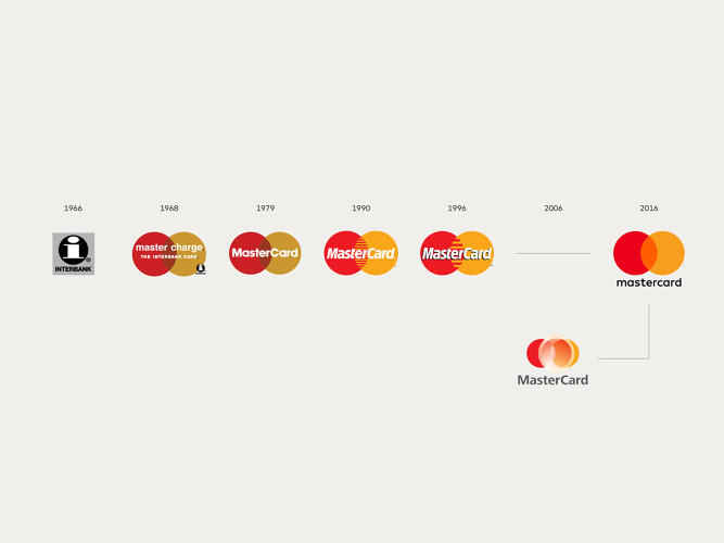
When Bierut took stock of the existing logo and its evolution, what he saw were slight tweaks to accommodate various technical challenges around where it was used most in the last 50 years: as a decal in store windows and on credit cards. MasterCard has issued over 2.3 billion credit cards, which means that this logo is one of the most widely distributed and recognizable symbols in modern times.
“They’ve never changed the overlapping circles, but they’ve made it aggressively complicated due to technical requirements,” he says. For example, adding a drop shadow behind the white lettering if the yellow fades in the sun. Since it’s often challenging for printers to reproduce the overlap of red and yellow, why not turn the center of the venn diagram into interlocking colors, like teeth on a zipper. To make the letters easier to read, make the font taller, condense it, and attenuate certain letters. Aside from those tweaks, the logo has remained more or less the same, which has strengthened customer recognition.
“Every day clients want to know what will it take to be the Nike swoosh,” Bierut says. “They think that these logos are born like this on day one and of course they’re not. For any company that achieves that, it’s because they’ve made a long investment in the use of primary elements. The reason those things are rare is that it’s so easy and tempting to get bored and say, ‘We’ve had it for five years it’s boring; let’s change it.'”
To Bierut, it wasn’t about a jarring overhaul; rather it was giving the core elements—the overlapping circles—room to sing.
“The question for us was, evolution usually means a further and more complex articulation,” Bierut says. “In this case, what struck us is that underneath this stuff are two of the three primary colors on the wheel and the most simple shape, which is circle. And they own this . . .That’s a gift we were given. We were smart enough not to—or failed to be dumb enough to—throw it all away.”
Rebooting The System
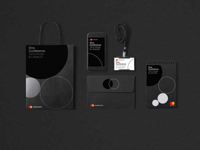
The team at Pentagram knew that they wanted to keep the interlocking red and yellow circles, but they looked at ways to tweak the logo so it could inform a larger identity system that can be rolled out across everything in MasterCard’s orbit: credit cards, window decals, websites, apps, digital products, printed materials, and partner content, like sponsorships.
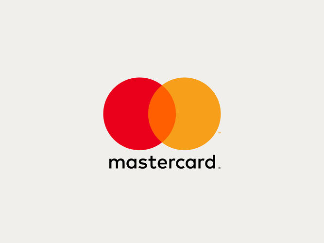
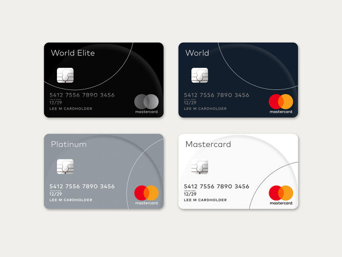
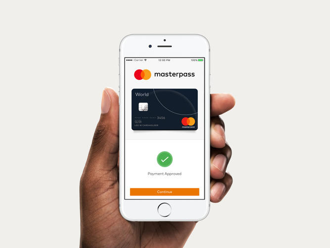
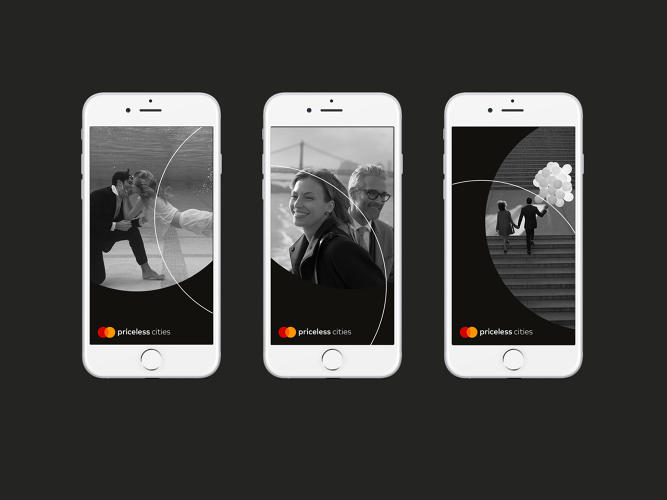
The red and yellow circles overlap, but gone is the comb effect; now you just see a slice of orange where they meet. Pentagram decided to place the MasterCard wordmark outside of the symbol and rendered it in lowercase font so that all 10 letters in the name could have circular curves in them. The placement of text in relation to the symbol is flexible, too. This strategy allows the symbol to work for everything, like its MasterPass digital payments product and Priceless rewards program, and relies on the circles to say MasterCard without needing additional text, which simplifies the graphics needed to brand all the arms of the company. This way, the logo can be used consistently in all the places that it appears. Because MasterCard issues cards through partner banks, the look of most cards is out of their control. By simplifying the logo, the company is eliminating some visual dissonance that occurs.
The circle motif is a through line in MasterCard’s visual identity and it manifests in the way the photographs are cropped, as a graphic flourish on campaign leaflets, and as a pattern on physical credit cards.
“I would not even take credit for designing this mark,” Bierut says. “We took their DNA and went through this process of distillation. With each wave of simplification it felt sharper cleaner and more flexible.”
Evolving The System for The Mobile Era
Along with the new logo and identity system, MasterCard is also announcing an expansion of MasterPass, its digital payments system and new capabilities, like smartphone compatibility with contactless payment readers regardless of what operating system the user has. With the tech giants like Apple, Google, andSamsung getting into the banking game, traditional financial companies are under more pressure to stay competitive with changes in digital transactions.
“Create the actual digital products is a big thing for us and a cultural transformation,” says Cindy Chastain, senior vice president of customer experience and design at MasterCard. “As we’re evolving as a company, this is the right time to evolve our brand identity.”
In the past, the logo was mainly seen by consumers on their physical cards and in the windows of merchants that accepted the credit cards; now it’s in those places plus on our smartphones, smartwatches, and computer screens. And as MasterCard builds out its products—like MasterPass—it needed a brandmark that could balance legibility and flexibility. The new system does just that.
“This is not about being clever,” Bierut says. “To me, MasterCard doesn’t want to be known as the company with the ingenious logo; they just want to make sure they’ve got a set of visual assets for them to navigate the world as it is now.”
Article property of factodesign.com
``We took their DNA and went through this process of distillation. With each wave of simplification it felt sharper cleaner and more flexible.``
Michael Bierut – Pentagram
