Qantas, the biggest Australian airline and a major player in the global aviation sector recently unveiled its new logo and refreshed branding, created in collaboration with consultant designer Mark Newson and in partnership with Australian design agency Houston Group. We have a look at the results of their work.
The Identity
![]()
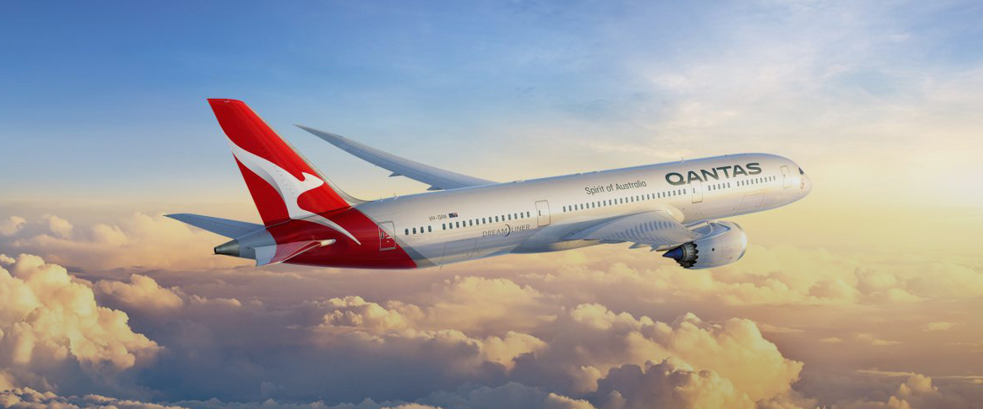
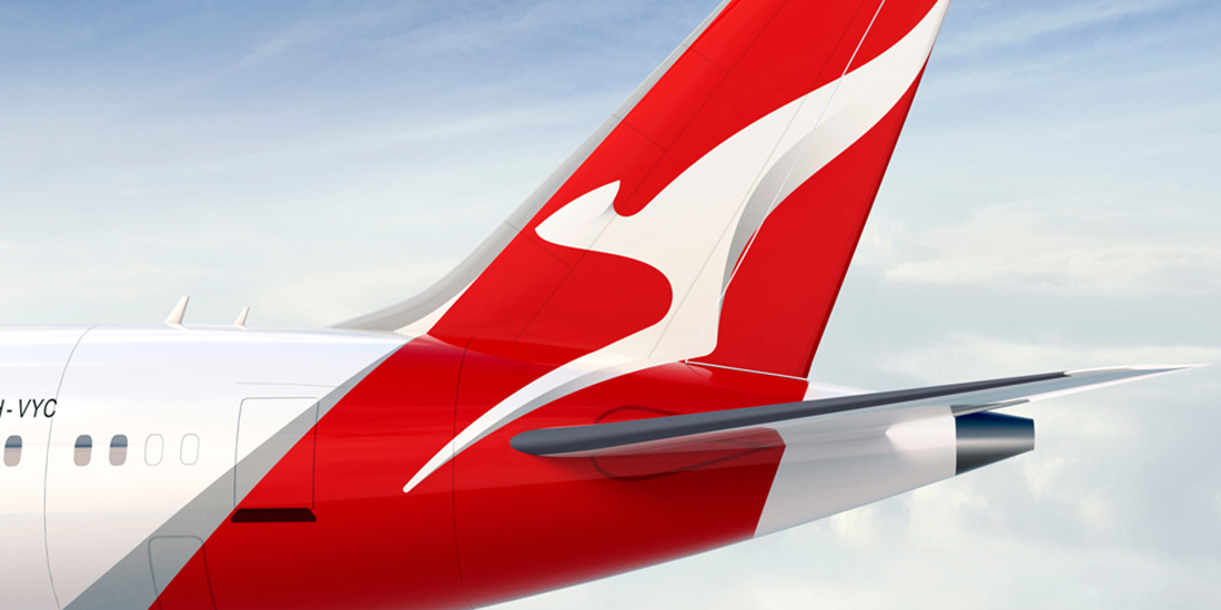
The new Qantas logo is a step towards simplification of the brand mark and the adding movement and depth to the kangaroo icon.
“The key opportunity for us was in contemporising the ‘roo. Making it more streamlined, and simplifying the shape. It’s evolved beyond a literal kangaroo – it’s become a unique brand symbol. We spent just as long handcrafting the Qantas logotype. We focussed on making it more streamlined, as if air is pushing across the top.” – Mark Newson
![]()
We love the new Qantas logo and despite the fact that the mark derives heavily from what a kangaroo actually looks like, we feel the icon has already developed into something more than a picture of an animal and became a unique symbol of the airline itself. We like how the typography becomes a plane fuselage in the logo and the type itself in a big improvement from the unnecessary slanted version from 2007.
The Applications
The logomark has been superimposed to create fluid and subtle background and graphic devices and the newly introduced Ciutadella typeface has been rolled out across all channels and the main font set.


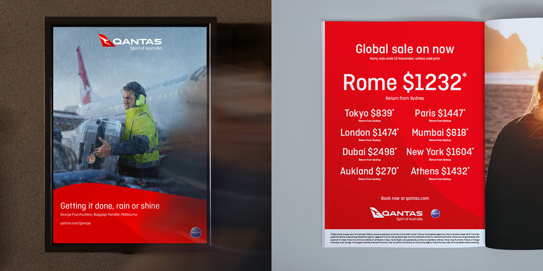

We like how the new backgrounds look like and whilst the result is leaning towards a more corporate look rather than something a consumer brand would use, the fundament for further creative development is strong and if blended with impactful and engaging imagery as well punchier type weights (more connected to the logo type) can offer a more B2C-oriented visual communication.
Source: Houston Group, Airdesign, BrandNew