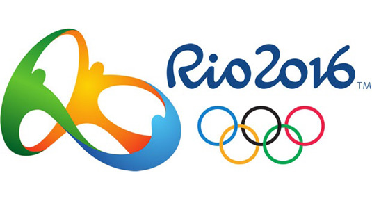
HOW DO YOU CREATE the logo design for the most complex visual identity in the world? The Olympic Games is a tough gig for any firm: once you’ve won the project – through a prolonged bidding process that can pit over one hundred studios against each other – there’s a long list of organisations and competing aims to satisfy, and a target audience of the whole world.
In September 2009, Brazilian agency Tatil beat 139 design studios and ad agencies to win the Rio 2016 Olympics logo job. Speaking at Design Indaba 2016, founder Frederico Gelli explained the challenges involved in creating such a visible logo. “It had to reflect local culture – but at the same time be universally understood,” he said.
Tatil brought the whole team – including the IT department and receptionist – into the design process. The team created over 50 different logos before arriving at the final design.
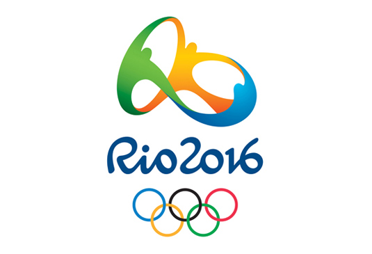
On New year’s eve, the 2016 emblem was shown to the world. Rooted in Rio’s cariocas (citizens), the graphic device shows people jubilantly joining hands, while the colour scheme reflects Rio’s environment. Yellow symbolises the sun, blue the sea and green the forests.
However, once the emblem was released into the world, it began to take on new meanings. “It was amazing. People started to see things we didn’t put there consciously,” Gelli admitted. “These alive ideas, it’s an alive brand. You don’t control it.”
Here are four design aspects – some consciously planned; some created unconsciously – you might not have noticed int the Rio 2016 Olympics logo…
01 The Shapes Map the Landscape
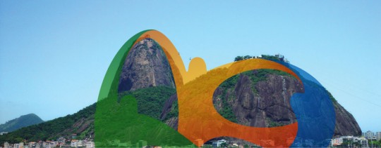
It’s widely known that the shape of Sugarloaf mountain is referenced in the emblem. What wasn’t known – until now – is that all the curves and spaces represent local landmarks, from the surrounding mountains to the islands. Hold the logo up on the beach and you can apply it to every part of the surrounding natural environment.
“We wanted to give a sculpture city a sculpture logo,” Gelli told us after his talk. “We put all the curves that nobody knows. I’ve never talked about this – only Sugarloaf because the logo uses that for its main shape – but all the curves [represent the landscape]. We tried to bring the shape of all the big mountains that we have because it was really important that the people of Rio could feel represented in the logo.”
02 The Emblem says ‘Rio’
At certain angles, the dancing people almost assume letterforms. “Many people started to see the word ‘Rio’ in the logo,” said Gelli. “The major of Rio said to us: ‘Oh, great! You put Rio in the symbol. We said, er…” he laughed. “That’s something we never imagined.”
“But unconsciously we did put those things there. Before we started to design things – to find the best colour, textures, shapes, things like that – we tried to identify the soul. In this process, when you’re trying to find the unique perspective that the creative challenge has, you put the seed on the floor to grow,” he explained. “The materialisation is just a consequence of this whole process.”
03 The Abstract Heart
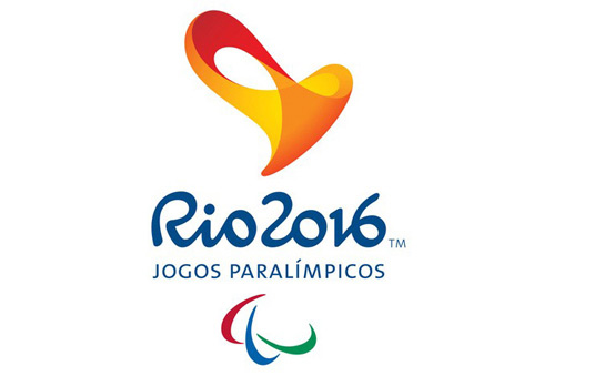
The Paralympics logo mixes two archetypal symbols: the heart and the infinity symbol. “It’s not an obvious heart,” says Gelli. “But it was important to find symbols that are perceived as positive in all cultures.
“We used 3D because we wanted to create a tactile experience. You have a lot of blind people. We wanted to open a new experience for them.”
04 Three New Forces
One interpretation Gelli heard involved an outcome he hadn’t planned. “One day a man in the slum told me that the three forces are the people, the company and the politicians – they’re together in a big hug to change the city and to change the country,” he explained.
“I think that happened, in a certain way,” he adds. “You can see in Rio today a huge challenge, a huge change, in the city – and it was part of this big hug that happened.”
Article by Creative Bloq
It had to reflect local culture – but at the same time be universally understood
Frederico Gelli – Founder at Tatil Design Agency
