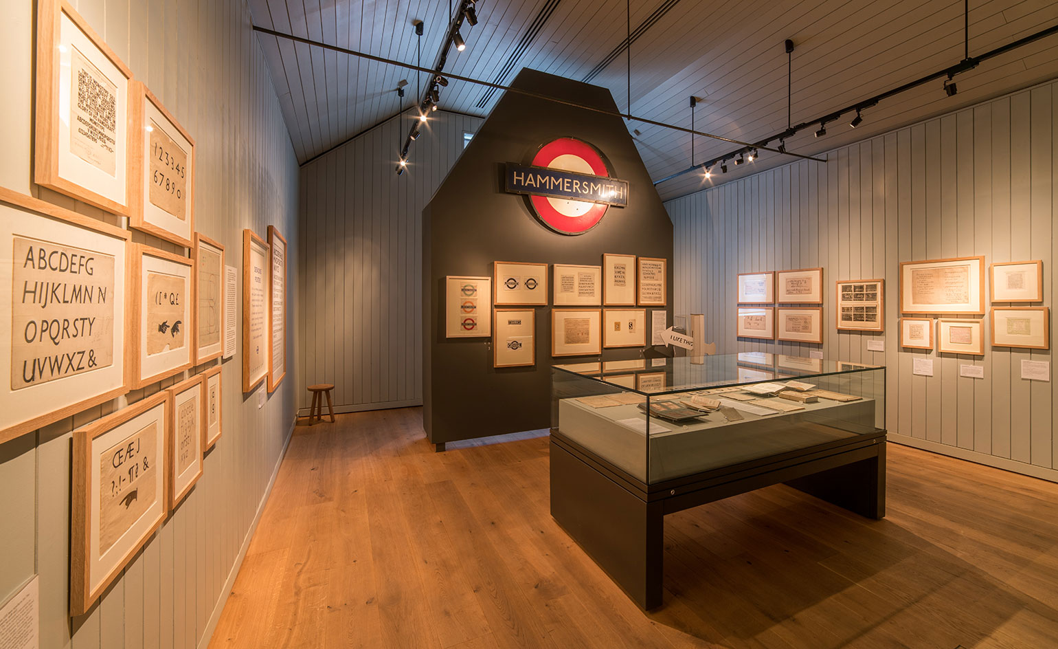
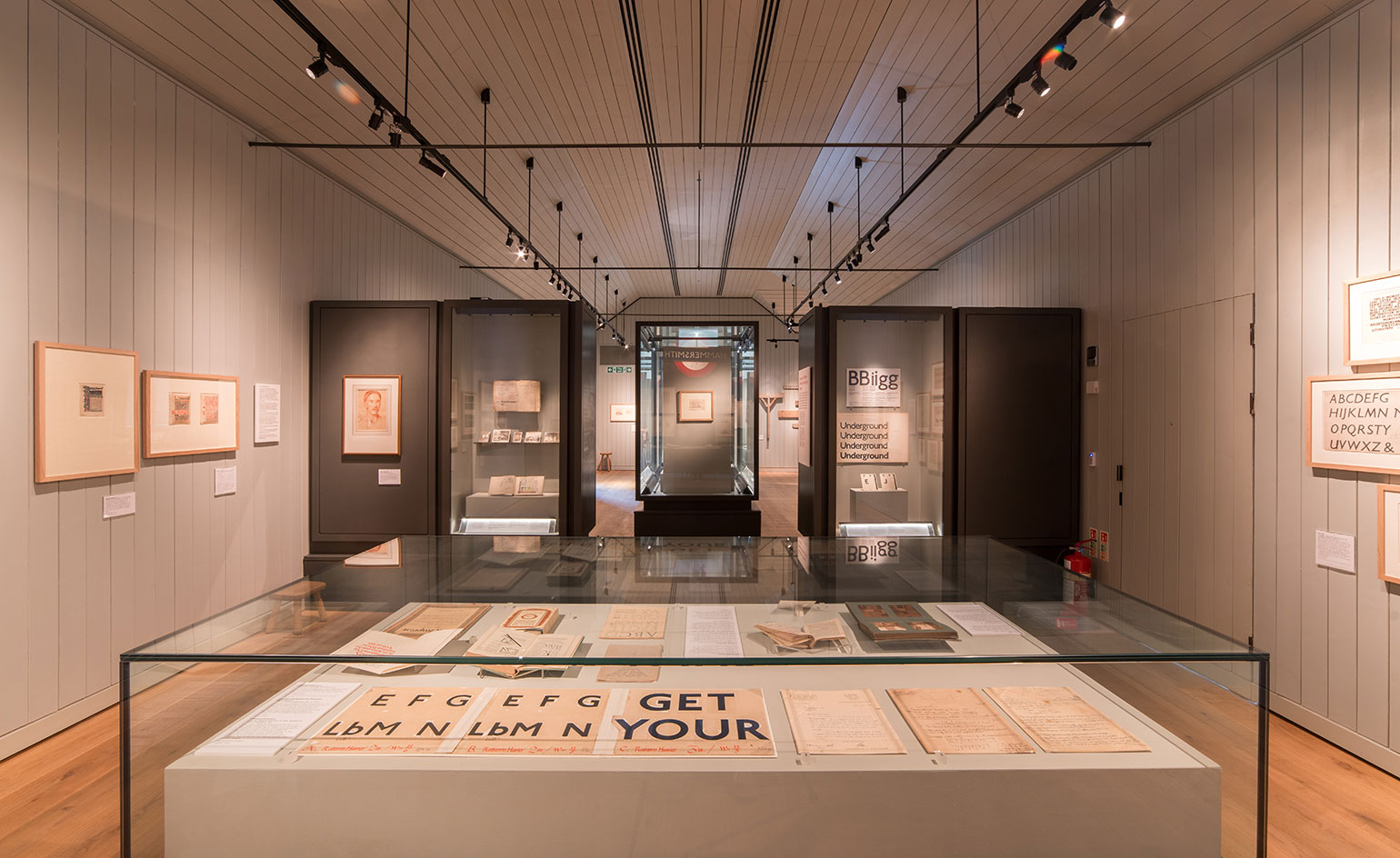
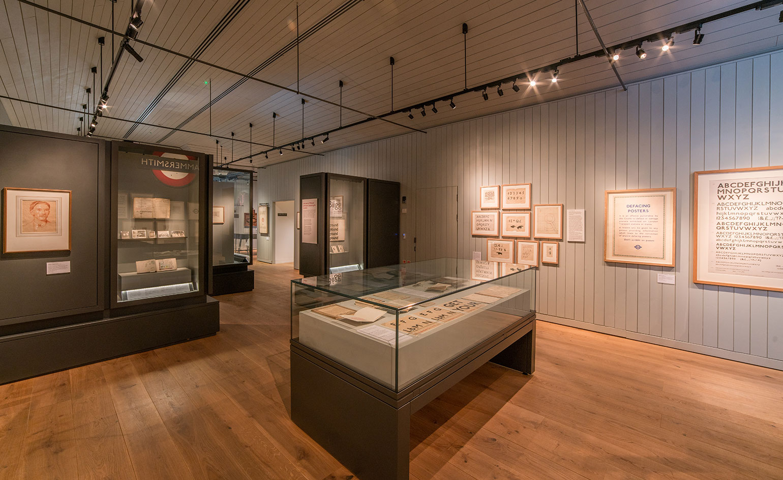
IT seems ironic, if not mildly amusing, that one of the most urban of signifiers of all – the famous London Underground typeface – was dreamt up in a small Sussex village. And yet it was. That same lettering is celebrating its 100 anniversary this year, so in tribute, the Ditchling Museum of Art + Craft is putting on a show.
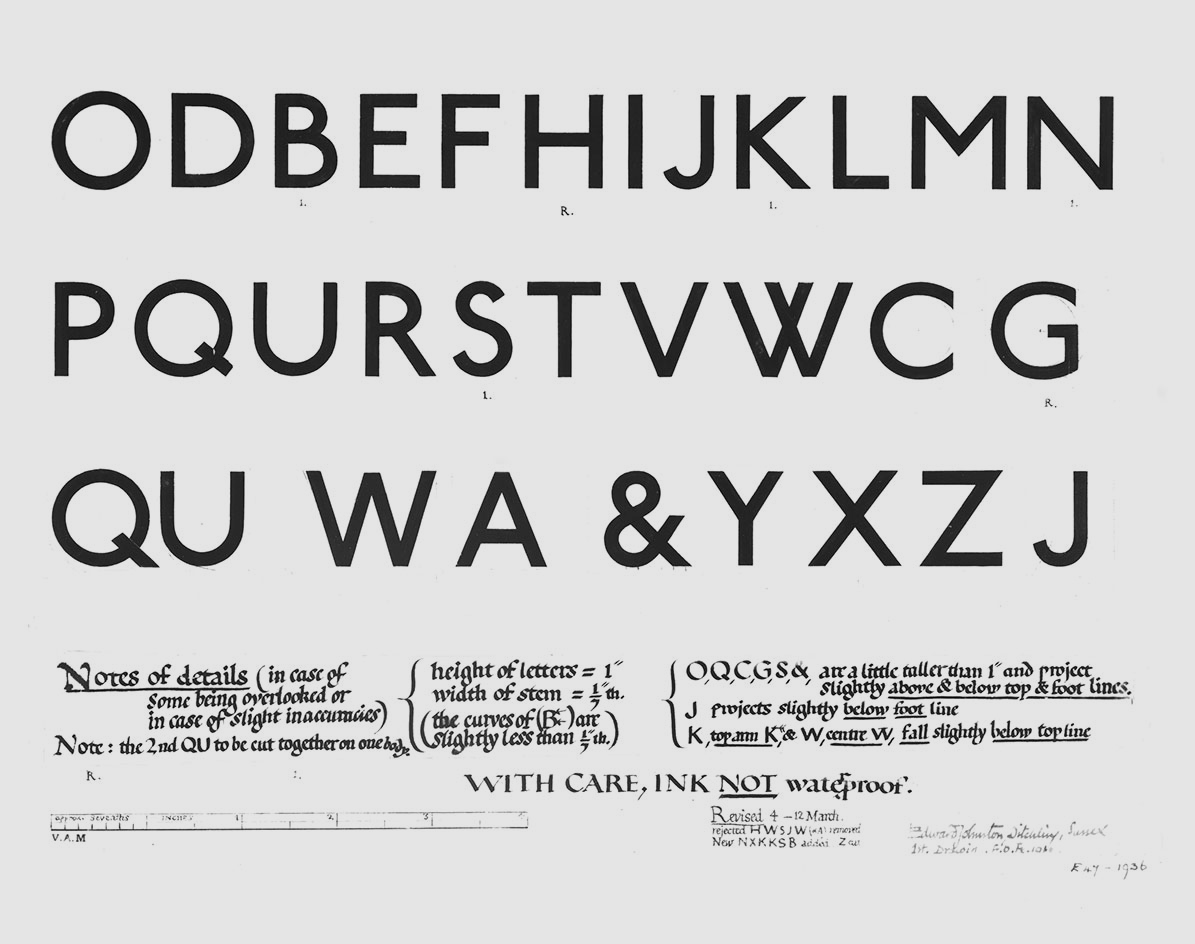
‘Underground: 100 years of Edward Johnston’s Lettering from London’ tells the tale of calligrapher Edward Johnson and traces the evolution of his sans serif alphabet, now known as Johnston Sans, through a series of working drawings and early prototypes.
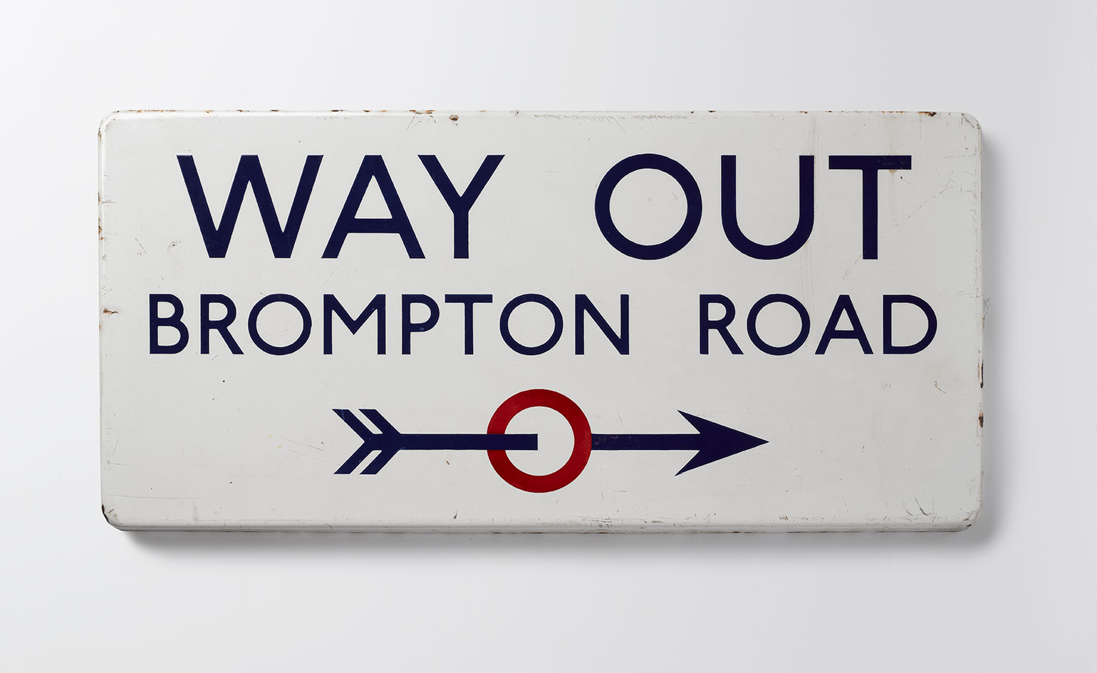
Commissioned in 1913 by Frank Pick, the commercial manager for the London Underground Railway, the typeface aimed for nothing more than consistency and clarity. ‘The bold simplicity of the authentic lettering of the finest periods and yet belonging unmistakably to the 20th century,’ as Pick put it.
At the time, disparate companies and identities made up the tube network and Edwardian London was plastered with competing commercial slogans in increasingly elaborate scripts. Ever the purist, Johnston went back to his calligraphy roots and simplified the Roman letters down to their very essence, distilling along the way a visual identity that endures today. (The font was only updated once, and ever so slightly, in 1979.)
The exhibition looks at Johnston’s work and his role in the Arts and Crafts movements which was, at the time, in full swing in the Sussex countryside. The relationship between Johnston and Eric Gill, a friend and former student of Johnston’s, comes under scrutiny too. Gill Sans – another popular sans serif font – was inspired by Johnston Sans, after all. But it is the enduring character of Johnston Sans that steals the spotlight.
Written by Sam Rogers for Wallpaper, published 29 March 2016
Image one: Victoria and Albert Museum
Image two, three and four: Brotherton and Lock
Image three: Ditchling Museum of Art + Craft
The bold simplicity of the authentic lettering of the finest periods and yet belonging unmistakably to the 20th century
Frank Pick