TYPEFACE DESIGN HAS a western problem: for years, most Arabic typefaces have been designed by Latin-language typographers. But Arabic is built differently than Latin—its letters can have different contextual shapes, they always connect, and they don’t use upper and lowercase letters—which means applying western ideas about type design is asking the script to conform to an unnatural set of standards.
“In the last 60 years Arabic has gone through many changes, and not really positive ones,”says Peter Bil’ak, founder of Dutch type foundry Typotheque. “It’s been subjected to western printing techniques, which cannot accommodate the number of glyphs [in Arabic].” The resulting product is “Simplified Arabic,” a legible but anemic version of the calligraphic script that Bil’ak calls “obviously not great.”
The problem is that Arabic is an incredibly complicated language, and despite its ranking as the fifth most spoken language worldwide, there’s a shortage of typographers with a native understanding of the script. Bil’ak says this is because there are few specialised typography courses available in the Middle East.
To remedy that, Bil’ak just launched a new type foundry called TPTQ Arabic. Along with Kristyan Sarkis, his co-founder and the Lebanese designer behind the custom Arabic typeface that will decorate the new Louvre in Abu Dhabi, Bil’ak intends to dedicate the practice to developing expressive and authentic Arabic typefaces. He says hosting lectures and workshops for other designers will play into achieving that goal.
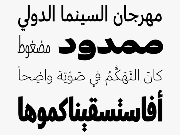
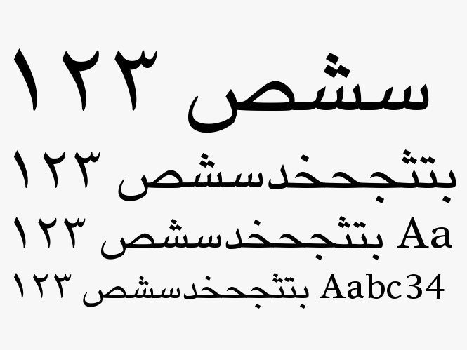
TPTQ Arabic’s first font is Greta, a system of 39 different styles that come in four widths and ten weights, from a very compressed hairline width to extra bold. Greta was inspired by the Naskh writing style, which is meant for reading at smaller sizes than the older Kufi script, once used for Qu’rans. Bil’ak calls it a “very universal, versatile tool for contemporary Arabic,” and is courting interest from television stations that may use it for multimedia displays.
It would be difficult to tally up the total number of available Latin fonts in existence, but if you look at Fonts.com, you’ll find more than 20,000 Latin font families. By comparison, there are just 108 Arabic font families. “In many ways it feels like this script is 200 years behind Latin, because lots has been tried with Latin,” Bil’ak says. There’s been some of that with Arabic: a few years ago, Lebanese designer Rana Abou Rjeily, for instance, created an experimental Arabic typeface that had detached letters, like Latin scripts. Most newspapers and books use Yakout, a Simplified Arabic typeface released by font company Linotype in 1956.
Monotype, the massive American type company, has released others. But as far as a vast portfolio of nuanced, practical typefaces—one that includes work from established foundries and indie designers alike—Arabic lags behind. Bil’ak says this is simply because not enough designers have paid attention to creating Arabic fonts. “There’s room for expression, but it hasn’t been explored or looked at in detail.”
Parts of the Middle East have been slower to adopt digital devices than the Western world, so designers have been similarly slow to address challenges presented by adapting Arabic script to small screens. For instance, many Arabic characters have overhanging, looping features that could affect their legibility and readability if handled incorrectly. Latin letters have fewer of these flourishes, and yet are constantly being optimised for mobile consumption, as we’ve seen with recent typeface-overhauls at tech giants like Apple, Facebook, and Google.
Article edited from wired.com | Images copyright of LinoType & TPTQ Arabic
When I started I realised it’s a design challenge, but it’s also a technological challenge—I could not find the tools,” he says. Bil’ak programmed his way out of that problem, and since then, commercial tools have become available for creating Arabic fonts. Adobe, a heavyweight in this arena, has Arabic typeface design tools on the market. Now it’s just a matter of stoking ingenuity.