NatWest goes trendy with its new logo that is an iteration of a mark from 1968, supported by a complete new approach in applications, but is it good enough for a viable and sustainable visual solution or an eye candy without long-term relevance?
The Identity
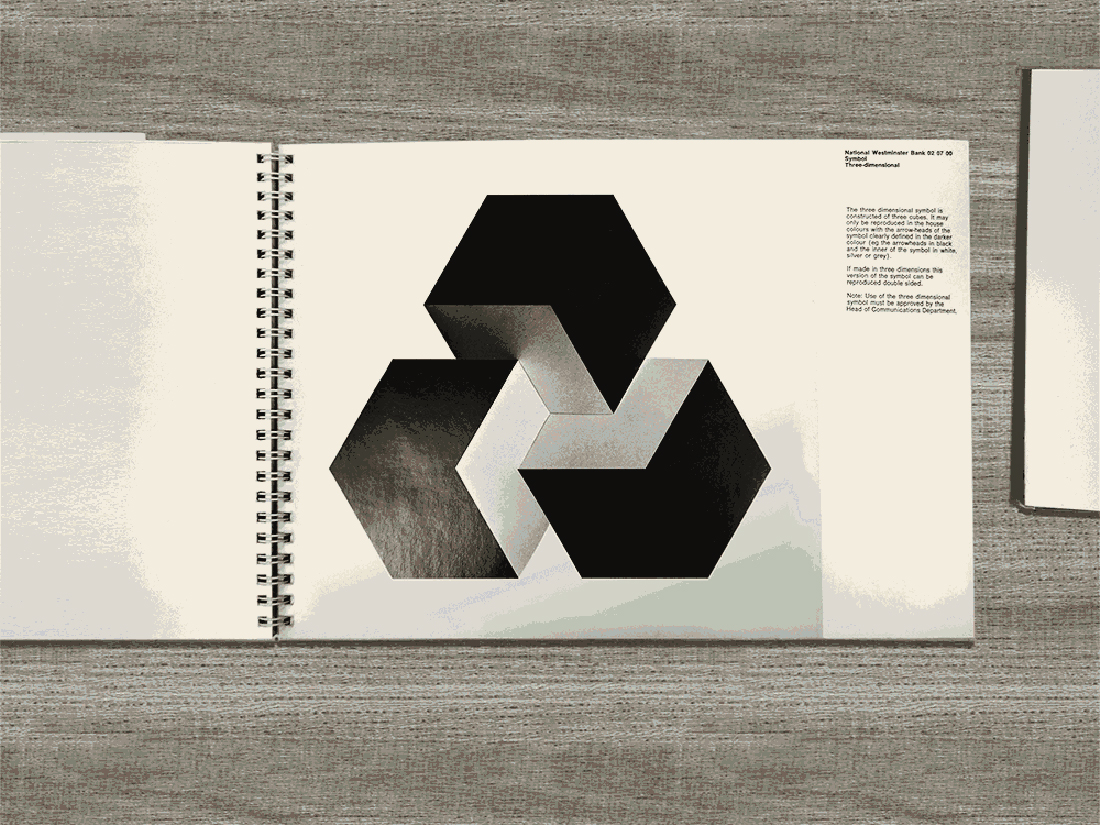
The Futurebrand team, which was appointed to give the NatWest brand a lick of new paint, dug up NatWest’s old corporate guidelines and stumbled upon a gem – original mark in the form of a set of three interlocking cubes which represented National Provincial Bank, Westminster Bank and District Bank coming together to form NatWest. The team decided to use it as a base for the development of a new logo. The conversion resulted in a mark that balances the original cube set with the 2014 iteration of the visual identity.

The previous iteration of the logo has sustained the test of time, confidently promoting its three arrows symbol for the last 35 years with only small tweaks over the years.

The new, seemingly subtle graphical change completely changes the meaning of the brand mark. Until now the logo arrows stood for mobility and progress in its visual communication while the cubes are more static, and NatWest will probably want to now pitch solidity, security and safety to its audiences.
We really like the new logo and how it’s looking to utilise its original cube elements in communications. It’s also encouraging to see companies adding a bit of complexity into their logos, making them more impactful in the digital environment. The tiny surface gradients and cube shading would be unthinkable 10 years ago when print was still dictating the framework for visual identities.
The logo works really well as red on purple but we are not fans of the red and white version. It is also a shame that Futurebrand decided to simplify the beautiful cube shading found on the original mark. We love the lighting detail and it would be good to see the same effect to the new cubes.
The Applications
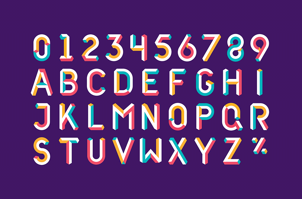
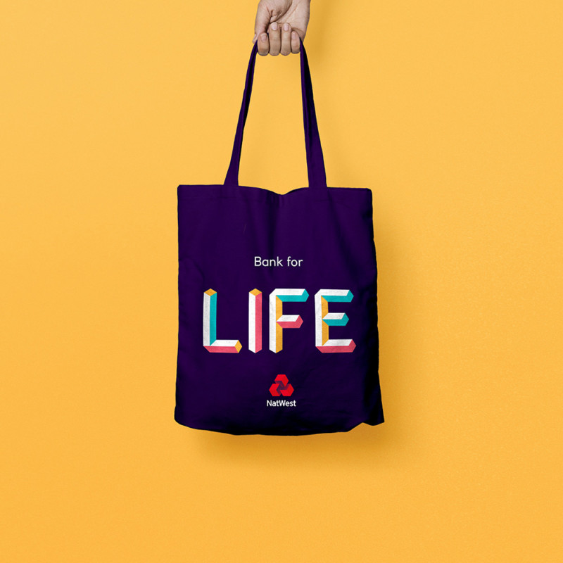
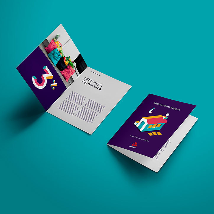
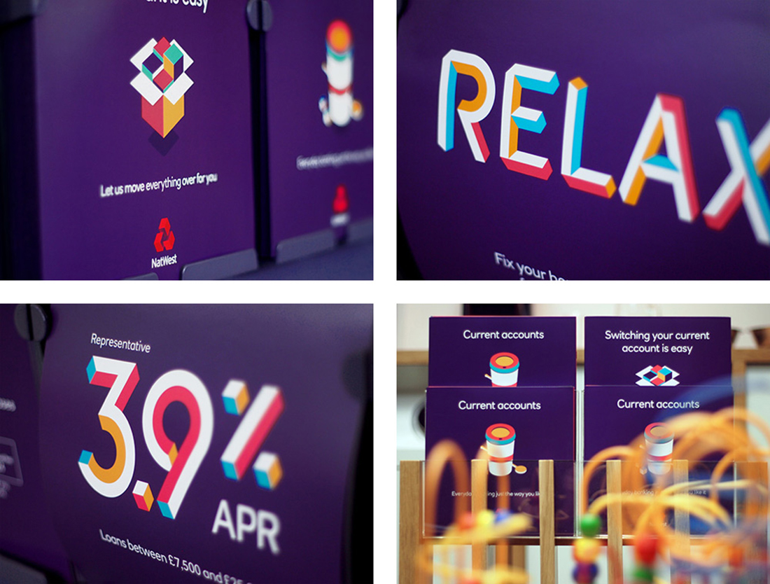
The cubes (literally) formed the building blocks of NatWest’s new brand system. Together with the introduction of the new colour palette including purple, pink, teal and yellow, the visual communication is designed to look “vibrant and optimistic”.
“We’re now unlocking the power of the individual cube as one of the core visual assets. Demonstrative, animated and colourful, it’s the perfect vehicle to show the bank’s proactive personality. From a humble cube we’ve literally got the building blocks to tell all manner of compelling stories. Our visual identity uses this simple idea to illustrate almost anything imaginable – to build a unique world for its customers.”
Dan Witchell, executive creative director at Futurebrand
We see how the new design can work as an optimistic and vibrant way of communicating with NatWest’s audiences and it is interesting to see a shift in finance sector to a more approachable, friendly and playful character.
The find the quality of the design very good, however we feel that the style of applications are too disjoined from the new logo. The character of the two is very different and there is a stylistic connector missing that would reinforce the consistency of the brand. It would be great to see the gradient from the logo being introduced to the applications, using red as dominant colour and revising the colour palette to compliment the red+purple fundamentals better.
The applications can work well as a marketing campaign but we wouldn’t bet our money on this style sticking for long with NatWest.
The Ad
The new NatWest TV ad was introduced alongside the new brand and as part of a “We are what we do” marketing campaign. Created by M&C Saatchi, the black and white video focuses on integrity, responsibility and accountability for actions, no matter the differences.
We are unsure how this serious, emotional and sentimental marketing campaign (in black and white!) is supposed to tie in with the vibrant, optimistic and colourful communication system developed by Futurebrand. It seems like Natwest has taken both agencies by surprise by going in two opposite directions at the same time without communicating their intentions too much.
A strong identity with room for improvements
The new logo is a step forward and will surely keep the immortal brand fresh and relevant for years to come. The applications need some extra attention and a higher level of consistency is something we think would benefit the NatWest’s visual communication system.
Check out some of our own Banking and Business projects below
Oman Arab Bank Debit Cards
We created a new range of Debit Cards for the Oman Arab Bank customers that reflects the new vision of the business.
Back 2 Business Brand Development
We were appointed to refresh the Back2Business Oman event branding to reflect the vision and ambitions of the organisers.
